Brand Attributes
quality genuine approachable trustworthy impactful
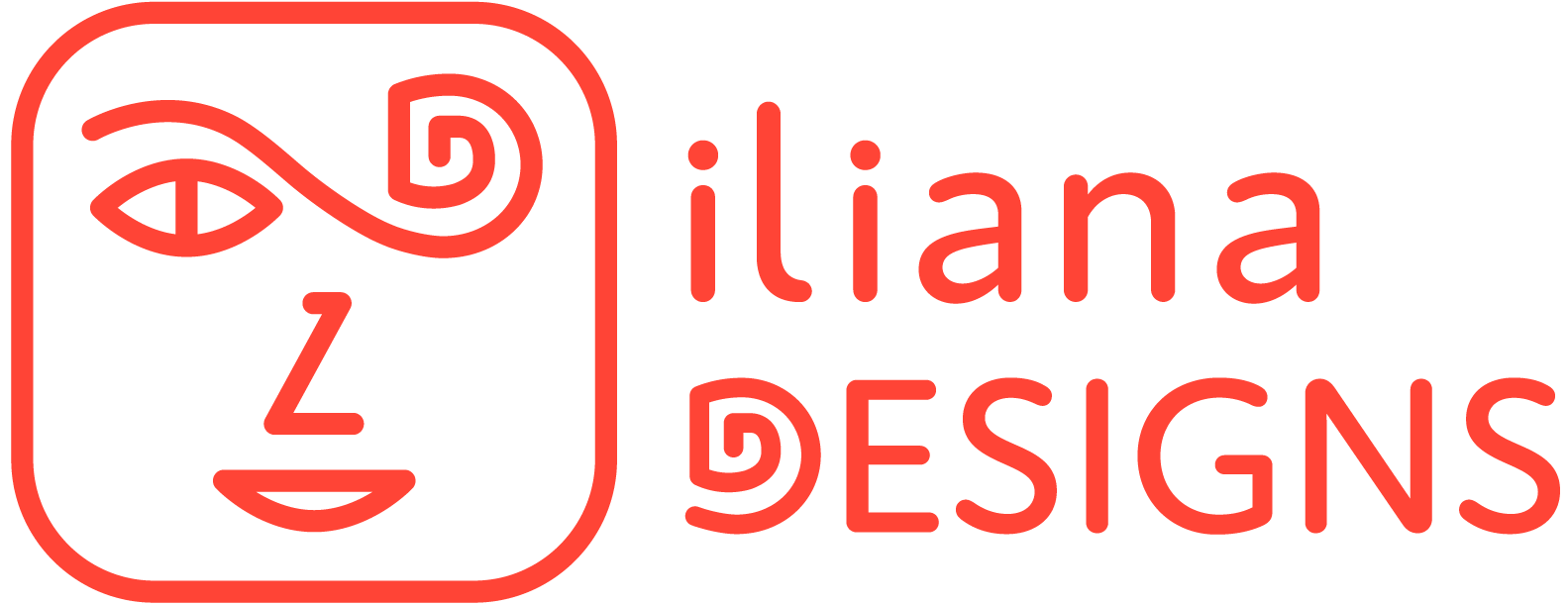
Logo Rebrand
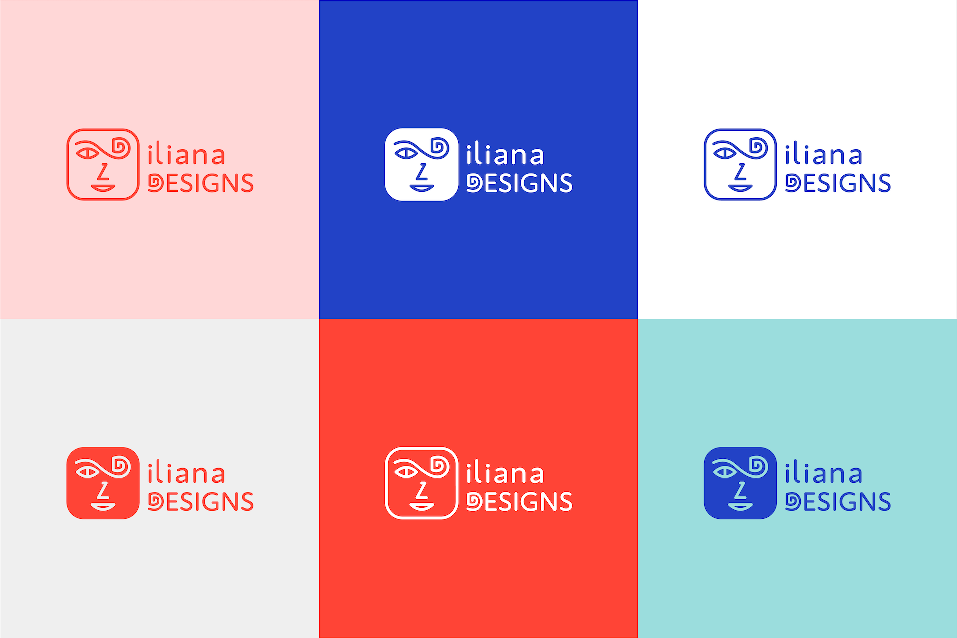
I’ve had the same logo since about 2015. I created it because at the time I was branching out on my own as a freelance graphic designer, and I wanted to have a recognizable mark for my business. For this assignment, I wanted to keep most of it the same with some minor edits and tweaks. Below, I will go into a bit more detail about my design process and the reasoning behind my choices for the new look.

Construction
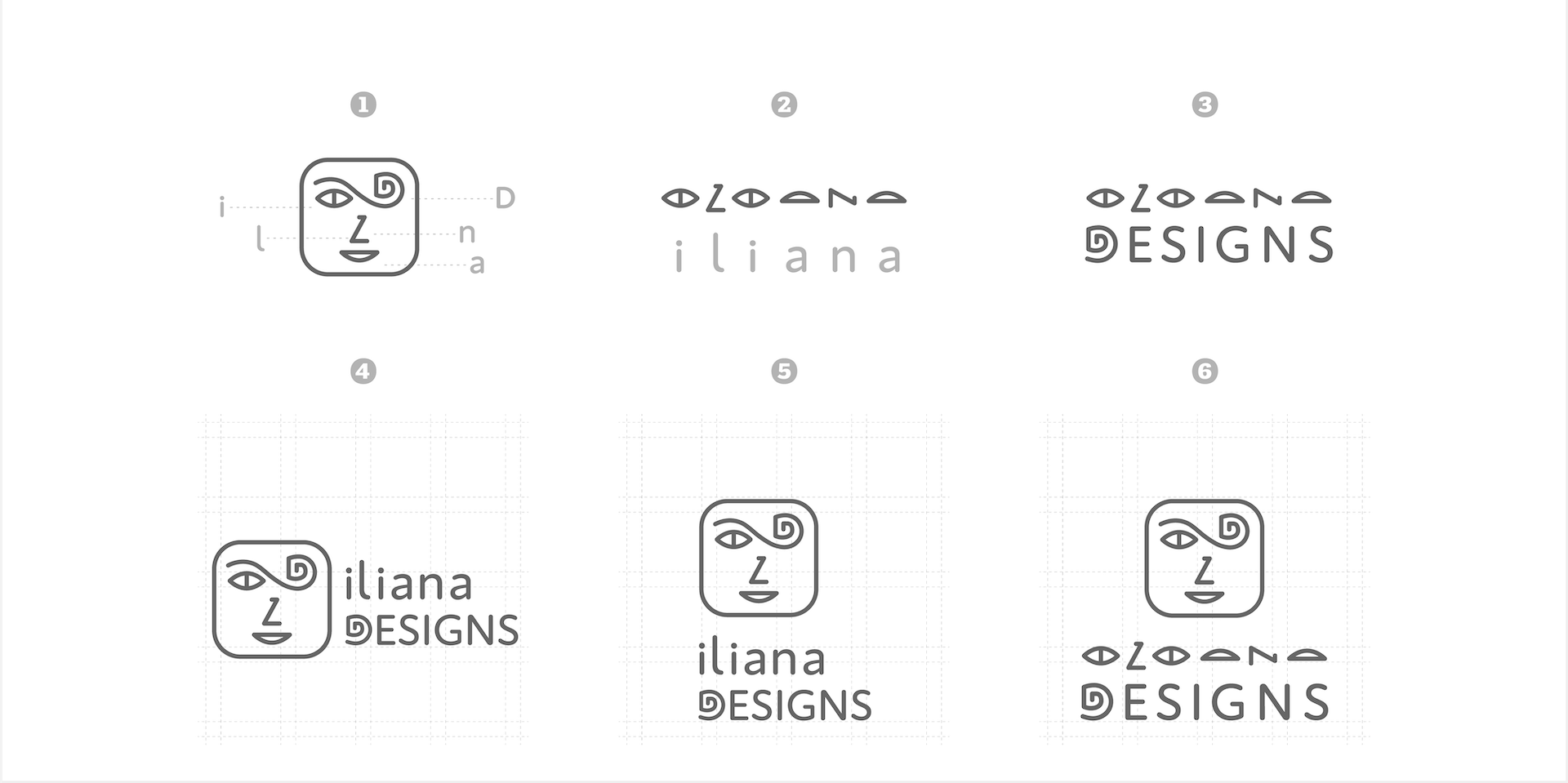
When I started ideating on the type of logo I wanted to create for my brand, I knew A) I wanted to have a symbol, and B) I didn’t want the symbol to be overly abstract. To make a long story short, I decided to use the letters in my first name for my logo mark.
Below, you’ll see in figure (1) that the symbol is a face created with the letters in my name, along with an added letter “D” for Designs. Figure (2) explains this a little better, showing how each individual letter is represented in the face. I’ve always liked that my name is a double palindrome, so I felt free to use this logic for the “L” and the “N” of my name as the “nose” of the face.
The final figure (3) shows the full logotype. It’s pretty self explanatory but this is how it would look minus the symbol.
Figures 4–6 are all the versions of the logo with the symbol.
Typography
Color